
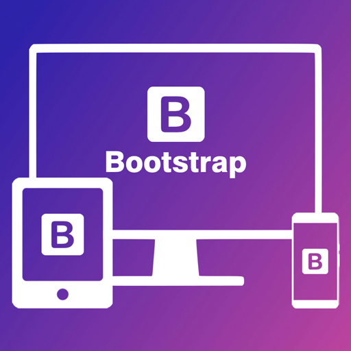
Learn how Bootstrap helps you make mobile-friendly websites easily
Bootstrap is a CSS framework that makes designing responsive and beautiful web pages easy. It provides ready-to-use classes for grids, buttons, forms, and more.
<!DOCTYPE html>
<html>
<head>
    <title>CodeWithSaeqa</title>
    <link href="https://cdn.jsdelivr.net/npm/bootstrap@5.3.2/dist/css/bootstrap.min.css" rel="stylesheet">
</head>
<body>
    <div class="container">
        <div class="row">
            <div class="col-md-6">
                <h1>Hello, CodeWithSaeqa!</h1>
                <p>This is a responsive column using Bootstrap.</p>
            </div>
            <div class="col-md-6">
                <img src="https://via.placeholder.com/150" class="img-fluid" alt="Placeholder Image">
            </div>
        </div>
    </div>
</body>
</html>
Leave a Reply