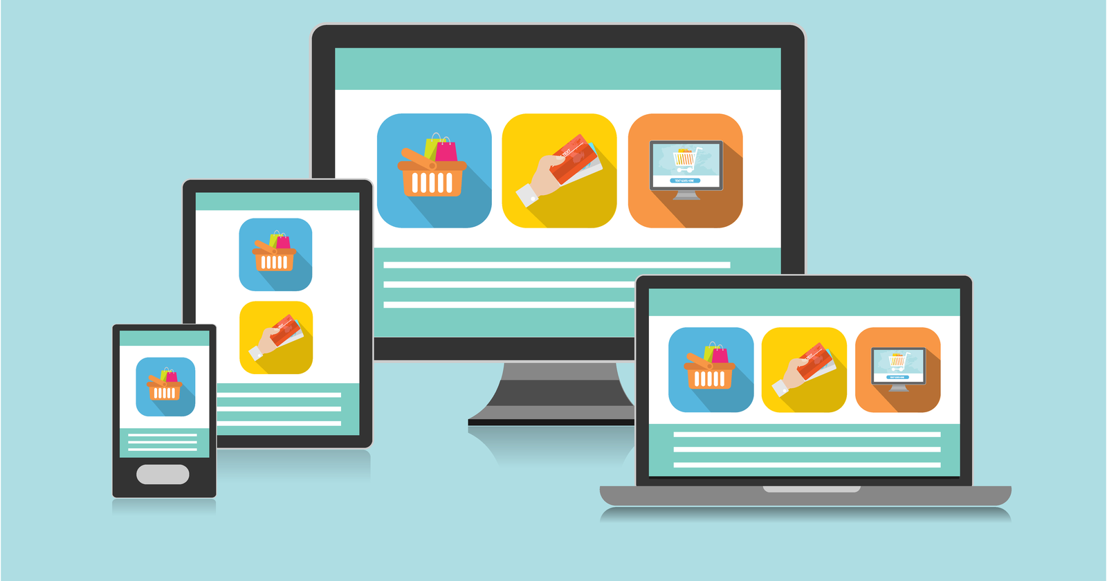
Learn how to create websites that look great on mobile, tablet, and desktop using responsive design techniques.
What is Responsive Design?
Responsive Design means creating websites that automatically adjust to different screen sizes.
Your website should look good on:
- Mobile phones📱
- Tablets 📲
- Laptops 💻
Why is Responsive Design Important?
Today, most users visit websites using mobile devices.
If your website is not responsive:
- Text will be too small
- Layout will break
- Users will leave your site
✅ Responsive design improves user experience and makes your site look professional.
Basic Example using CSS
Here is a simple example using media queries
/* Default style (desktop) */
body {
  background-color: white;
}

/* For screens smaller than 768px (tablet & mobile) */
@media (max-width: 768px) {
  body {
    background-color: lightblue;
  }
}
When the screen size is small, the background color changes
Responsive Layout Example
<!DOCTYPE html>
<html>
<head>
  <title>Responsive Example</title>
  <style>
    .container {
      display: flex;
    }

    .box {
      width: 50%;
      padding: 20px;
      background-color: lightgray;
    }

    /* Make it responsive */
    @media (max-width: 768px) {
      .container {
        flex-direction: column;
      }

      .box {
        width: 100%;
      }
    }
  </style>
</head>
<body>

<div class="container">
  <div class="box">Box 1</div>
  <div class="box">Box 2</div>
</div>

</body>
</html>- On desktop: boxes are side by side
- On mobile: boxes go one below another
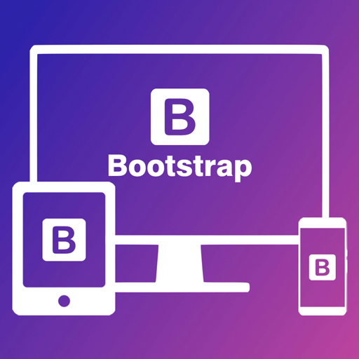
Using Bootstrap for Responsive Design
Bootstrap makes responsive design much easier
<div class="container">
  <div class="row">
    <div class="col-md-6">Column 1</div>
    <div class="col-md-6">Column 2</div>
  </div>
</div>
- On large screens: 2 columns
- On small screens: stacked automatically